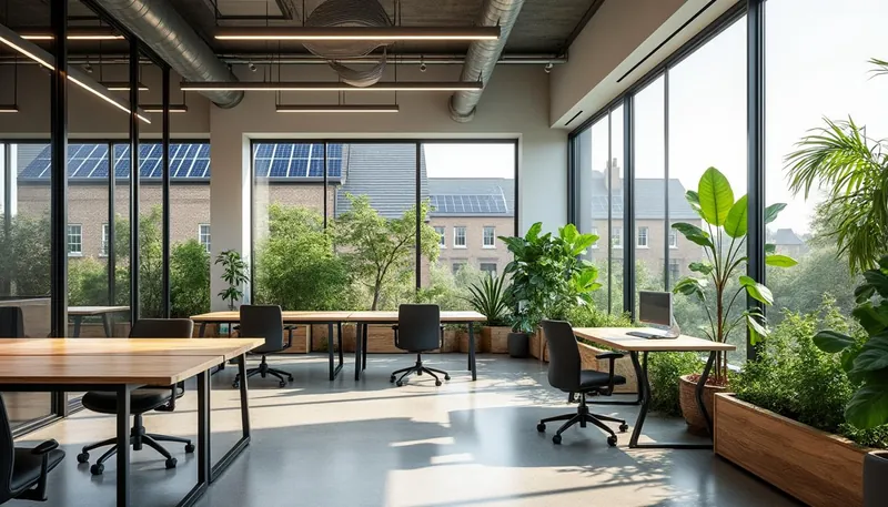
As creativity becomes an increasingly vital component of workplace success, understanding how to leverage color schemes to enhance this creative output has never been more important. The convergence of psychology, design, and well-being can harness the power of color to create environments that stimulate innovative thinking. Whether you are redesigning a corporate office, creating a home workspace, or simply seeking ways to enhance inspiration, knowing which colors foster creativity is key. It’s fascinating to consider that something as simple as a color can significantly impact mood, energy levels, and collaborative efforts among teams. In this exploration, we’ll delve deep into different color palettes, analyze their psychological effects, and provide practical examples for various workplace environments.
Brief:
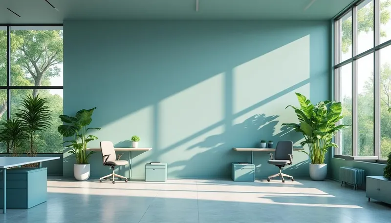
- Utilizing calming colors like blue and green helps enhance focus and reduce stress.
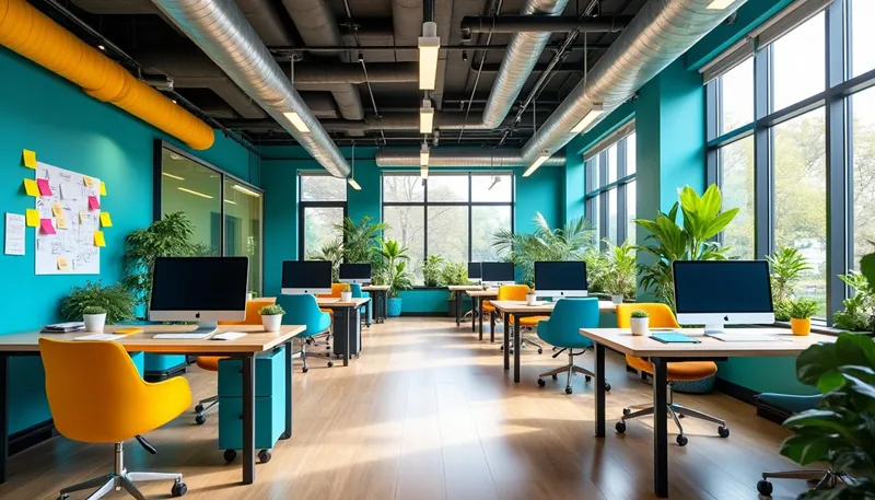
- Bright colors such as yellow and orange stimulate creativity and enthusiasm in collaborative spaces.
- Thoughtfully combining colors can foster an inviting and productive work atmosphere.
- Colors have specific psychological effects that directly impact mood and productivity.
- Accessibility considerations, such as color blindness, are essential in workplace designs.
Understanding the Emotional Impact of Colors
The emotional responses to color are profound and well-documented, often stemming from cultural and individual experiences. For instance, colors are not just visual stimuli; they play a crucial role in how people feel and relate to their surroundings. Warm colors like red and orange may evoke a sense of urgency and excitement, while cooler shades like blue and green often promote tranquillity and focus. A combination of color psychology and design principles can drive how effective and engaging a workspace becomes.
To grasp the emotional impact of colors, it’s important to see how they can distinctly alter our perceptions. An environment painted in soft blues and greens can provide a sense of calmness, while vibrant yellows can encourage a lively atmosphere conducive to brainstorming sessions and idea generation.
| Color | Emotional Impact | Recommended Use |
|---|---|---|
| Blue | Calmness, Trust | Focus Areas, Individual Work |
| Green | Balance, Harmony | Collaboration Zones |
| Yellow | Optimism, Enthusiasm | Creative Spaces |
| Red | Energy, Urgency | Action Areas |
Selecting Colors for Different Productivity Needs
With a solid grasp of how colors affect emotions, the next step is to align these hues with distinct productivity requirements. Whether focusing on individual tasks, brainstorming ideas in group settings, or engaging in task-oriented work, color selection is pivotal. For quieter, focused work environments, calming blues are beneficial as they induce concentration. On the other hand, brighter colors such as yellow or orange work wonders in collaborative spaces, transforming a mundane meeting room into a hub of creativity.
Color can even enhance productivity by reducing stress; studies show that certain shades, particularly greens, help to lower anxiety levels and elevate focus up to 25%. This means a well-thought-out color palette could lead to heightened productivity across various teams.
| Productivity Need | Recommended Colors |
|---|---|
| Individual Focus | Calm Blue, Tranquil Green |
| Collaborative Environment | Vibrant Blue, Bright Yellow |
| Task-Oriented Work | Calm Blue, Energizing Orange |
The Influence of Color Combinations
Combining colors is a nuanced art that can dramatically affect productivity and mood within a workplace. Thoughtful color combinations not only provoke emotional responses but can also influence collaboration and creativity. For example, pairing blue with white can maintain a feeling of calmness while promoting clarity in organizational structures. On the contrary, mixing vibrant shades like red and orange can stimulate creativity but should be used judiciously to avoid overstimulation.
Here are some effective combinations worth considering:
- Blue and White: Calmness and organization for clearer communication
- Red and Orange: Enhanced energy and creativity, perfect for brainstorming sessions
- Green and Yellow: Balanced energy that fosters collaboration and teamwork
Optimizing Color in Digital Interfaces
The principles of color psychology don’t stop at office walls; they extend into digital interfaces too, impacting how users interact with your products. In today’s tech-driven workplace, color can influence everything from user decisions to engagement statistics. It’s crucial to select hues that evoke the desired emotional responses. For example, a call to action button in red can trigger a sense of urgency, while a steady blue helps build trust and reliability.
Additionally, ensuring color palettes are accessible is vital—for individuals with color blindness or visual impairments, the right contrast levels can enhance their user experience significantly. Utilize tools like Adobe Kuler to discover appealing combinations that cater to your design needs.
Creating a Personalized Work Environment
Having a personalized workspace directly relates to productivity and general satisfaction. When you design your environment to match your style and preferences, it becomes more enjoyable and motivating. Tailoring aspects of your workplace can turn ordinary spaces into inspiring hubs.
Think about the critical elements that resonate with your creative process:
- Ergonomic Furniture: Invest in comfort with chairs and desks that support your body.
- Custom Decor: Introduce personal elements like art and photos that inspire you daily.
- Lighting: Optimize natural light and desk lamps to reduce eye strain, enhancing focus and mood.
How Do Colors Affect Decision-Making in Group Settings?
Colors significantly influence decision-making processes. For example, red can evoke urgency, while blue promotes trust, shaping group dynamics effectively.
Can Colorblind Individuals Experience Color’s Emotional Effects?
Definitely! Although their perception differs, colorblind individuals can still feel the emotional responses elicited by colors. Accessible palettes enhance their experience.
What Colors Are Best for Remote Work Environments?
Consider calming colors like blue and green to enhance focus and reduce stress, adding energizing pops of yellow or orange to spark creativity.
How Often Should I Change My Color Scheme?
Ideally, updating your color scheme every few years keeps the environment fresh, reflects brand evolution, and resonates with employee preferences.
Are There Colors That Universally Improve Productivity for Everyone?
Certain colors like blue and green generally enhance productivity, though personal preferences and cultural contexts may influence effectiveness.